Does An NFL Teams “Look” Impact Its Success?
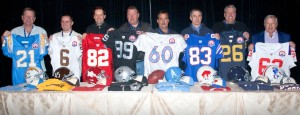
The 50th anniversary of the AFL has sparked a renewed interest in throwback uniforms.
This being the 50th anniversary of the American Football League, we are being treated to throwback jerseys and even throwback Officials’ uniforms. We may not be thrilled about the broad orange striped zebra shirts, but generally it has been refreshing to see the return of some great classic looks.
Just over a third of NFL franchises still use their classic look. A few have made minor variations on a theme. Another third have changed their look, and even their colors, several times, or are too new to evaluate for staying power.
What can be learned and inferred from the franchises that choose to keep traditional branding, versus franchises that change with the trends every few years? Is there a correlation between style and success?
It should be noted, we are referring to the modern era of the NFL that begins roughly at the end of the ’50s or the beginning of the ’60s when teams began widespread use of helmet art.
The Icons
The fine detail of graphics may be tweaked every few years, but the Packers have stayed with the same look they’ve had since they first put artwork on their helmets, back in the very early ’60s.
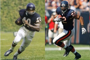
There isn't a great deal different in the uniform worn by Gale Sayers in the 1960s and Matt Forte today.
Ditto that for the Chicago Bears. I can hear a chorus of Bob Seeger’s ballad, “Still the Same.”
The Colts may be in a new town, but they still have the same threads. Be it Peyton Manning or Johnny U, maybe the stripes are a little different but that’s about it.
Of course, we oppose taking a storied team like the Colts out of Baltimore. In fact, keeping the same nickname and logo is considered sacreligious by some. Certainly when re-location occurs it is not only an opportunity but I would say a mandate to re-brand, but the Colts opted for making a statement about franchise tradition transcending location.
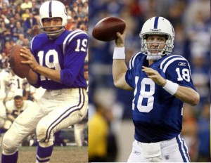
Whether it is Unitas in Baltimore or Manning in Indianapolis, the uniform of the Colts has gone virtually unchanged.
The Cleveland Browns, Acts I and II have been and remain bland, brown, boring, beautiful. The deal that sent the original Browns franchise, started by its namesake Paul Brown, to Baltimore, makes Soviet style revisionist history look honest. The league decided to pretend that the franchise began in Baltimore as if it were an expansion team.
All records, stats, and history relative to the franchise in Cleveland would be separated out for a future Cleveland expansion team to acquire.
Sounds to us like a way to get an expansion franchise (in Baltimore) with a veteran roster.
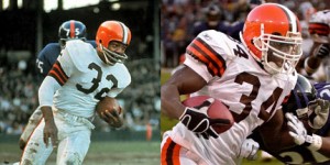
The uniform of the Cleveland Browns hasn't changed much since the days of Jim Brown.
At any rate, the tradition of the Browns, if not the true history of the franchise, continues in Cleveland today much as it did dating back to the All-America Football Conference in the late forties. Cleveland was one of four AAFC teams folded into the NFL when the AAFC folded. From decade to decade, and after a multi-year hiatus, not much has changed in the uniform.
The Oakland Raiders will be Silver and Black forever. The Raiders have not altered their uniforms in any significant conceptual way since Day One.
The Pittsburgh Steelers have kept their ironclad look. The franchise does drag out a yellow helmet on throwback day, but you have to back pretty far to find the time when they used it. In the modern era, there’s been only the plain black helmet on one side with the variation of the US Steel Corporation logo on the other. Now US Steel is a shadow of its original self, most of their huge, belching factories have been replaced by modern high tech industry offices, but the football franchise maintains the legacy in their look.
Since their admission to the AFL as an expansion team, the Miami Dolphins have kept the same basic branding with only cosmetic stylistic tweaks.
When the Chiefs franchise began in Dallas as the Texans, the uniform was pretty much the same. There was a solid red helmet with a white form in the shape of the map of Texas. When Lamar Hunt moved his franchise to Kansas City three years later, he changed the Texas map to an Arrowhead with KC ensconced inside the outline and there have been no significant changes since (1963).
Other than the usual stylistic updates in striping, the classic Viking uniform is unchanged since the franchise’s inception.
San Francisco may be the change capital of America, but not in football. Again, there have been minor stylistic tweaks on the jerseys and pants, but not in the colors or on the helmet. This is the only uniform San Francisco has had since inception.
The Cowboys have us torn. Their current look has become their classic look. It hasn’t changed since their early years. Yet their “throwback,” the first Cowboy’s uniform, with the starker contrast of blue and white and the more dramatic definition of the star on the jersey and the helmet almost makes us wish they’d revert to that one. Either way, the team is classic.
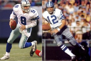
The Cowboys now occasionally wear a variation of their blue uniform, but the white uniform and star on the helmet have changed little since the days of Roger Staubach.
The Jets have gone back to the future. They were the New York Titans for a year or two, but when they became the Jets, their current look was their look. It was their look when Broadway Joe Namath took them to their brightest day, based out of Shea, and it is their look now, when Namath is honored at Giants Stadium. In between, however, the Jets experimented with a more modern look. We congratulate them for returning to the classic.
When the Buffalo Bills used royal blue and silver as their colors with plain silver helmets for the first year (only) in the AFL, it was to copy the Lions, of which Bills owner Ralph Wilson, Jr. was a minority owner as well. Other than adding the lion image and making subtle changes in the animal’s shape or posture over the years, the Detroit look hasn’t changed much.
The Bengals, Paul Brown’s second franchise, were designed to look exactly like the Cleveland Browns, his first, with the exception of the plain orange helmets, to which Brown added the Bengal tiger stripe.
The helmets remain essentially as they were, however the uniform style, color distribution and graphics have changed with the times. Still, their retention of the helmet puts them in the traditional camp.
Whatever their city, the Cardinals are the same old birds. Their uniforms have had various looks over the years, reflecting trends and styles of a given era, but whether in St. Louis or Arizona (Chicago predates the modern era) the helmet look has essentially survived.
The Cardinal on the helmet received an attitude adjustment for the ’08 season. Perhaps that’s what got them to the Super Bowl. But the change was quite subtle and didn’t stray from the basic concept of the team logo.
The New Orleans Saints have kept the faith. The color of the pants has changed back and forth from white to black over the years, but the basic uniform look and the helmet are constant since the team’s inception.
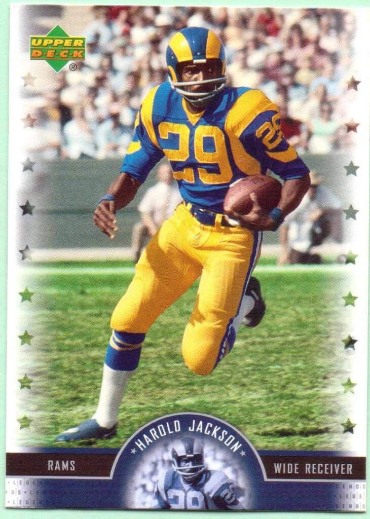
The Rams have the same theme with systematic updates. The classic Ram horn on the helmet hasn’t changed much in size or style. Otherwise there have been lots of variations in the uniform styles, color distribution and graphics. The franchise has found a way to balance tradition with fashion trends in their approach to systematic updates. Now if we could just keep them in one town for more than a few decades at a time (Cleveland, LA, St. Louis).
The Giants have kept some classic elements in their look but have also altered the look enough so that there really is no classic Giants image.
Mood Rings: Pre-Merger Teams that Follow the Trends
These are the teams in existence before the merger who change their look and/or their colors frequently.
The Falcons have used variations on the same basic logo but have done so with red helmets, black helmets, smaller image, larger image, all black uniforms in Jerry Glanville’s era, red, black and white, etc.
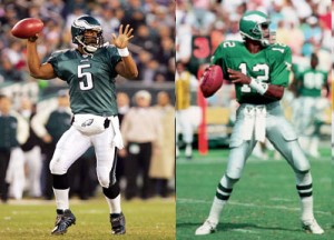
The style of the Eagles uniform hasn't changed a great deal since the days of Randall Cunningham, but the colors worn by Donovan McNabb are a strikingly different shade of green.
After their one year imitation of the Lions, the Bills have gone through a variety of color and uniform variations using navy blue, royal blue, slight variations in the shade of red, white helmets, red helmets, blue pants, white pants, with at least three distinctly different treatments of the buffalo in the logos.
The Redskins and Eagles have been the most dynamic of the original NFL teams. They were among the first to adopt helmet art, and have continued to revise. We’ve lost count of the concepts and color configurations either or both of these teams have used over the years.
The Chargers have stayed closer to one theme but have varied it significantly in color and more subtly in logo presentation.
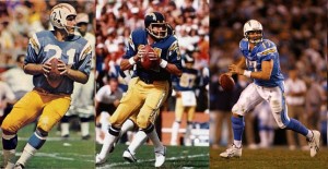
The Chargers changed their look a bit in the 1970s while Dan Fouts was the quarterback, but the uniform Philip Rivers wears today is little different than what John Hadl wore in the 1960s.
The Patriots changed their look significantly three times in their 50-year history, as another AFL original.
The Broncos have had five different looks in their 50-year history as AFL originals.
Post-Merger Teams: Some Do, Some Don’t
The newest expansion teams are too new to evaluate, but there are the Seahawks who have kept the integrity of their helmet logo but have changed everything else including colors.
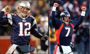
After changing their look, both the Patriots and Broncos went from Super Bowl losers to Super Bowl champions.
The Bucs have had two very different looks and color schemes.
The Jaguars and Panthers have their original look after more than a decade.
The Texans are basically the same as at inception but haven’t been around as long.
The Titans suited us by changing their name and their look after leaving Houston. Whether or not they will keep the look long enough to make it classic is yet to be seen. One can only wonder if their frequent use of the original Oilers uniforms for the anniversary year is cursing them to such a horrible start.
The Ravens have created a classic post-Cleveland look.
So… it splits out more or less 50/50 with the jury still out on the newest ones.
So How Does Brand and Image Consistency Translate into Competitive Success?
The following teams have made no significant changes to their look in the modern era of the NFL:
Green Bay: 4 Super Bowls, 3 Lombardi’s
Chicago: 2 Super Bowls, 1 Lombardi
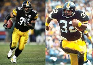
The Steelers uniform made little changes between the years when Franco Harris won his Super Bowl titles and when Jerome Bettis led Pittsburgh back to the top.
Colts: 3 Super Bowls, 2 Lombardi’s
Cleveland: 0 Super Bowls
Oakland: 5 Super Bowls, 3 Lombardi’s
Pittsburgh: 7 Super Bowls, 6 Lombardi’s
Miami: 5 Super Bowls, 2 Lombardi’s
Kansas City: 2 Super Bowls, 1 Lombardi
Minnesota: 4 Super Bowls, 0 Lombardi’s
San Francisco: 5 Super Bowls, 5 Lombardi’s
Dallas: 8 Super Bowls, 5 Lombardi’s
Jets: 1 Super Bowl, 1 Lombardi
Between these 12 teams, there are 46 Super Bowl appearances for an average of just over 3.8 appearances. There have been 29 Super Bowl victories between them for an average of 2.4.
The remaining 20 teams who have had at least a significant degree of change in uniform, logo and branding since the beginning of the modern era have made 40 Super Bowl appearances for an average of two, and have 14 victories for an average of .7 per team.
It may defy logic, but it seems obvious that there is a direct and significant correlation between classic team branding and competitive success. The only question is, does classic branding create a more enduring winning tradition, or does the lack of competitive success cause teams to keep changing their look to compensate?
John Wingspread Howell is a financial consultant, novelist, columnist and sportswriter. He publishes the online sports magazine Underdog Sports (www.underdog.sports.officelive.com) and is a syndicated writer and scribe for Bleacher Report and Sports Then and Now. He writes about underdogs, Buffalo sports, American soccer and women’s sports.
